
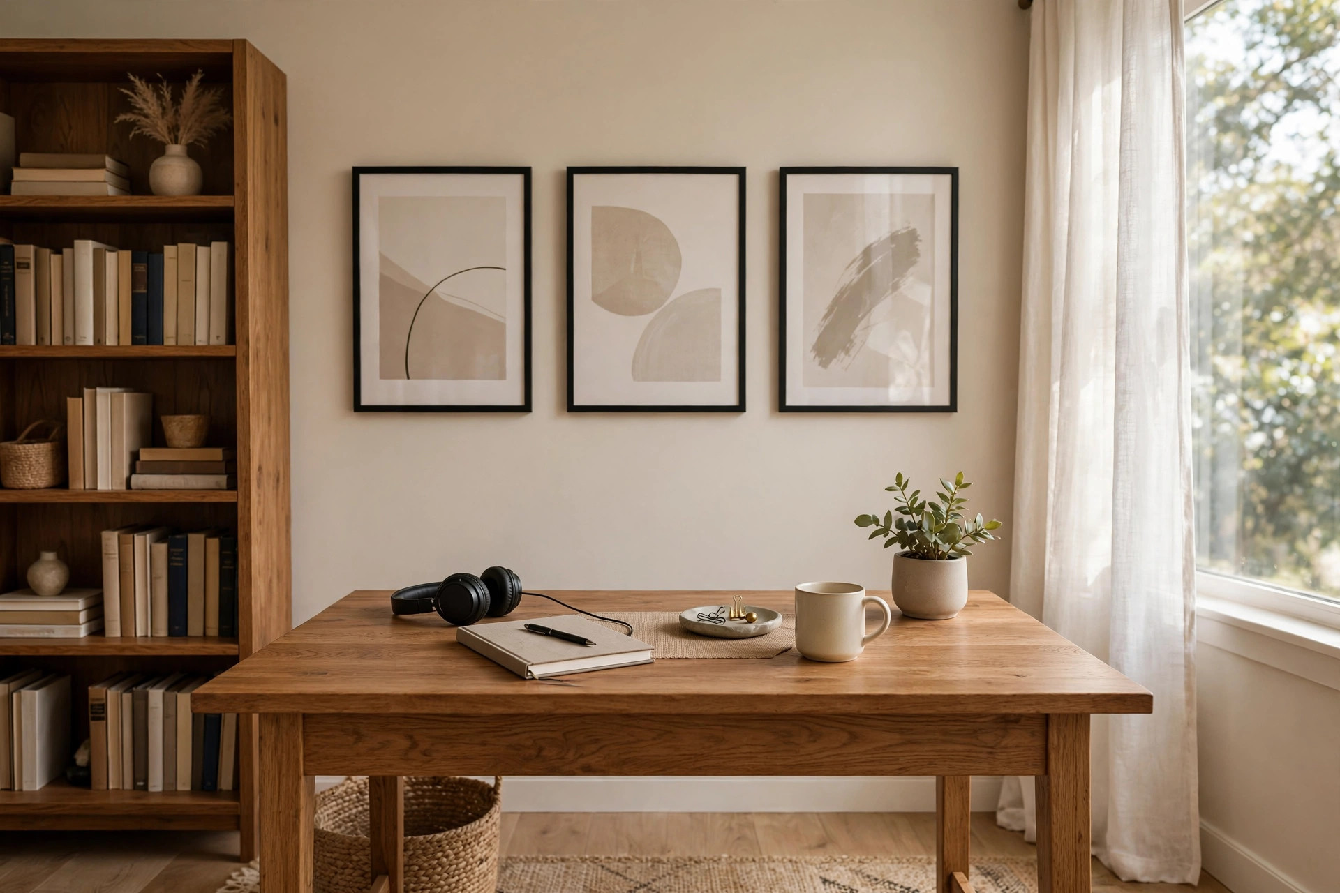

More people now work from home than ever before. The wall behind a desk has become part of the workday. It shows up on every video call. It is seen by clients, coworkers, and managers. For this reason, home office wall art for professional background use deserves real thought. A bare wall can look unfinished. A cluttered wall can distract. The right art sends a quiet message: this person is organized, serious, and proud of their space.
This guide explains how to choose wall art for a home office that looks professional on camera and in person. It covers colors, subjects, sizes, and prices. It also covers hanging, care, and safety. The advice is simple and practical. It is written for the average remote worker, not for an art expert.
Why a Professional Background Matters
Video calls are now a normal part of office life. People meet through a screen. They form opinions quickly. A neat background builds trust. It helps others focus on the speaker instead of the room. Studies of first impressions suggest that a tidy setting makes a person seem more capable. The wall behind the desk is the first thing others notice.
Wall art also affects the worker. A pleasant room can lift mood. A dull room can drain energy. Many remote workers report that a decorated office feels more like a real workplace. That feeling helps separate work hours from rest hours. When the office corner looks finished, the mind takes the workday more seriously.
There is also a career angle. Managers and clients judge professionalism. A thoughtful background shows care and detail. It costs little but says much. In a competitive job market, small details add up. The Spruce notes that home offices benefit from decor that blends function with style, and wall art is one of the simplest upgrades a remote worker can make.
What to Look for When Choosing Wall Art: Home Office Wall Art for Professional Background
Choosing art for a work setting is different from decorating a living room. The art must please the worker, look calm on camera, and fit a budget. A few rules make the choice easier.
Color and Tone
Color sets the mood of the room. For a professional background, soft and muted colors work best. Warm grays, soft blues, and gentle greens read well on video. They do not fight with skin tones on camera. They keep the viewer calm. Bold reds and neon colors can distract. They can also distort on low-quality webcams.
Neutral art pairs well with most furniture. A wooden desk, a gray chair, and beige art form a quiet set. If the room is small, light colors make it feel larger. Dark colors can feel heavy in tight spaces. The goal is balance: enough color to feel alive, but not so much that it pulls attention.
Subject Matter
The subject of the art speaks to the viewer. Abstract shapes are safe. They please the eye and carry no message. Landscapes and city scenes are also good. They suggest calm and breadth. Botanical prints add warmth without noise. Maps and architectural drawings fit well in business settings.
It is wise to avoid art that could divide viewers. Strong political images, jokes, or bold slogans do not belong in a professional background. Personal photos are fine in the room but are better placed off camera. The camera-facing wall should look neutral and welcoming to all.
Wirecutter often reviews home office gear and workspace design, and its guides remind readers that the background should support the work rather than steal the show.
Size and Scale
Size matters on camera. Art that is too small disappears. Art that is too large overwhelms. A common rule is to fill about two-thirds of the visible wall width behind the desk. One large piece often looks better than many small ones. It gives the eye one place to rest.
Before buying, measure the wall. Tape paper shapes to the wall to test sizes. Sit in the desk chair and look at the webcam preview. What the camera sees is what matters. The art should sit in the upper half of the frame, near head level, so it reads clearly on screen.
Frames and Finishing
Frames complete the look. Simple black or white frames suit most offices. Natural wood frames add warmth. Thin frames look modern. Thick frames look traditional. Match the frame to the style of the room. Mixed frames can work, but they need a common color or tone to look planned.
Glass and glare deserve attention. Shiny glass can catch light and create bright spots on video. Matte finishes or non-glare acrylic reduce this problem. If a window faces the desk, test the art at different times of day. Move a lamp if needed. PCMag covers home office technology and workspace tips, and its office guides often note that lighting and glare control matter as much as the decor itself.
Types of Wall Art for the Home Office
Many types of art suit a professional background. Each has its own cost and look.
Framed prints. These are the most common choice. A print in a simple frame is affordable and easy to hang. Art prints come in endless styles. They can be swapped when tastes change. Framed prints suit almost every office.
Canvas prints. Canvas gives art a painterly feel. No glass means no glare. Canvas works well in bright rooms. It is light and easy to hang. Large canvas pieces make a strong statement at a fair price.
Photography. Black-and-white photographs look classic and calm. Nature photography adds life. A single large photograph can anchor a whole wall. Keep the tone muted for a work setting.
Posters with quality frames. A plain poster can look cheap. The same poster in a good frame can look fine. The frame makes the difference. Choose thick paper or a mounting board for a clean edge.
Gallery walls. A set of three to six small pieces can form a gallery wall. Keep the layout neat. Use one frame color. Space pieces evenly. A messy grid looks worse than a bare wall. Gallery walls suit wider walls where one piece would look lost.
Shelves with small art. A floating shelf can hold small framed pieces and books. This adds depth to the background. Keep the shelf tidy. Two or three items are enough. More than that looks cluttered on camera. A floating shelf desk for tiny bedroom office setups can pair well with a shelf above, since both save floor space.
IKEA sells frames, shelves, and prints at low prices, which makes it easy to test a layout before buying expensive pieces.
Pairing Art with the Rest of the Office
Wall art does not stand alone. It should match the desk, the chair, and the lighting. A modern desk pairs well with modern art. A wooden desk pairs well with warm tones. The room should feel like one plan, not a set of random buys.
Desk choice shapes the whole room. An ergonomic standing desk for small home office spaces, for example, works best with art that is hung high enough to stay in frame when the desk is raised. Test the camera view at both sitting and standing heights.
Lighting matters too. The best task lighting for home office desk setup advice applies here: light the face first, then make sure the wall behind is softly lit. A dark wall behind a bright face looks harsh on video. A small wall light or a lamp aimed at the art can even out the scene. Herman Miller designs workspaces with lighting and ergonomics in mind, and its office planning guides stress that balanced light across the worker and the background looks best on camera.
Cost and Price
Wall art for a home office can cost very little or a great deal. Most remote workers spend between twenty and two hundred dollars per piece. A simple framed print often costs thirty to sixty dollars. A large canvas print costs eighty to two hundred dollars. Original art costs more but is not needed for a professional background.
Framing is often the largest cost. A basic frame from a discount store costs under twenty dollars. A custom frame can cost over one hundred dollars. Ready-made frames in standard sizes save money. Buy the art to fit the frame, not the other way around.
There are ways to save. Print shops can enlarge a favorite photo for a small fee. Thrift stores often sell solid frames for a few dollars. Digital downloads from artists cost less than shipped prints. Set a budget before shopping. A wall can look professional for under one hundred dollars total.
Wayfair and similar retailers carry a wide range of framed art and canvas prints, so it is easy to compare prices across styles before deciding.
Care and Upkeep
Wall art needs little care, but some care keeps it looking good. Dust frames and glass every few months. A dry cloth is enough. Avoid water on paper prints. Keep art out of direct sun. Strong sunlight fades colors over time. In sunny rooms, choose prints with UV-protective glazing.
Humidity can harm paper and wood frames. Bathrooms next door can raise moisture. In damp rooms, choose canvas or metal prints. Check the wall behind the art once a year. Look for marks or damp spots. Fix wall problems before they damage the art.
Rehang art if it tilts. Crooked art looks careless on video. A small level tool helps. Many frames drift over months as doors slam and walls settle. A quick check each season keeps the wall neat.
Safety
Safety matters when hanging art above a desk. A falling frame can injure and break equipment. Use the right hardware for the wall type. Drywall needs anchors. Plaster needs care and proper screws. Masonry needs special fasteners. Match the hook rating to the weight of the piece. Heavy art needs two hooks, not one.
Place heavy pieces with care. Do not hang a large, heavy frame directly above a monitor where it could fall onto the screen. Offset it to the side if the wall allows. Check hooks once a year. Loose hardware should be replaced at once.
Glass frames can break. In homes with children or pets, choose acrylic glazing or canvas instead of glass. Acrylic is lighter and safer. It also reduces glare, which helps on video calls. Keep cords and cables away from hanging hardware. A clean wall is a safe wall.
Steelcase researches office safety and ergonomics, and its workplace guides remind employers and remote workers alike that the home office should meet basic safety standards.
Frequently Asked Questions
What is the best wall art for a professional video call background? Simple, muted art works best. Abstract prints, soft landscapes, and botanical images in plain frames look calm on camera. Avoid busy patterns and bright colors. The art should sit at head level behind the desk so it shows clearly in the webcam frame.
How big should wall art be behind a desk? Aim to fill about two-thirds of the wall width the camera sees. For most desks, one piece between 24 and 36 inches wide works well. Test with paper cutouts first. Sit in the chair and check the webcam preview before drilling any holes.
Can I use personal photos as home office wall art for professional background purposes? Personal photos are best kept off camera. Family pictures can feel too private for client calls. Keep personal photos on side walls or shelves. Use neutral art on the camera-facing wall. This keeps the background welcoming to every viewer.
Does wall art color affect how I look on video calls? Yes. Bright or clashing colors can change how the camera reads skin tones. Strong reds and oranges may cast a warm tint. Dark walls can make the face look washed out by contrast. Soft neutrals, light blues, and gentle greens are the safest choices.
How much should I spend on home office wall art? Most people spend twenty to two hundred dollars per piece. A professional-looking wall can be finished for under one hundred dollars total with ready-made frames and prints. Spend more on framing than on the print itself, since a good frame lifts the whole look.
How do I reduce glare on framed art during video calls? Use non-glare acrylic instead of glass. Angle desk lamps away from the frames. If a window faces the art, hang pieces on the wall beside the window instead. Test the webcam view at different times of day, since sunlight changes through the hours.
A Short Final Word
Home office wall art for professional background use is a small project with a large payoff. It shapes how others see the worker on every call. It also shapes how the worker feels each morning. The rules are simple: keep colors soft, keep subjects neutral, size the art to the camera frame, and hang it safely. A modest budget is enough. With a little planning, the wall behind the desk becomes a quiet asset, one that works as hard as the person sitting in front of it.
UPLIFT Desk focuses on ergonomic office furniture and workspace design, and its setup guides pair well with decor planning for anyone building a complete home office.
References
Herman Miller. (n.d.). Office furniture and ergonomic seating. https://www.hermanmiller.com IKEA. (n.d.). Home furnishings. https://www.ikea.com PCMag. (n.d.). Technology product reviews. https://www.pcmag.com Steelcase. (n.d.). Office furniture and workplace research. https://www.steelcase.com The Spruce. (n.d.). Home and garden advice. https://www.thespruce.com UPLIFT Desk. (n.d.). Standing desks and ergonomic office furniture. https://www.uplift-desk.com Wayfair. (n.d.). Furniture and home goods. https://www.wayfair.com Wirecutter. (n.d.). Product reviews from The New York Times. https://www.nytimes.com/wirecutter
Was this guide helpful?

About David Wilson
The My Garden US editorial team writes practical, in-depth home and garden guides for American homeowners — tested advice, no fluff.
You May Also Like

Home Office Desk with Keyboard Tray Slide Out: A Full Buyer’s Guide
May 12, 2026 0 views
Small Rolling Desk for Laptop in Living Room: A Practical Buying Guide
January 7, 2026 0 views
Best Standing Desk Mat for Concrete Floors: A Practical Guide
January 2, 2026 0 views